Canvas Halloween Projects

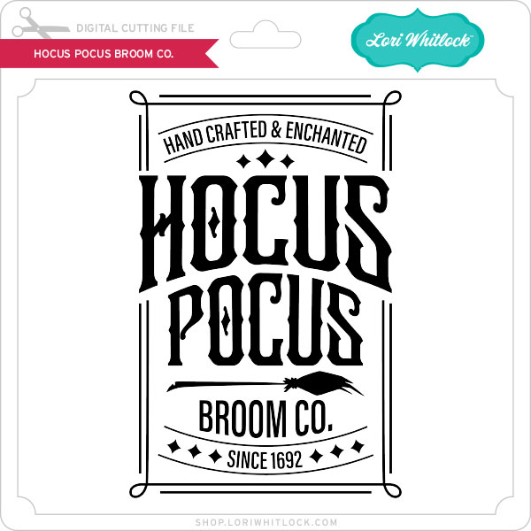
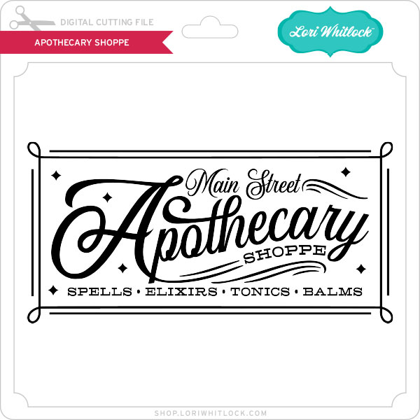
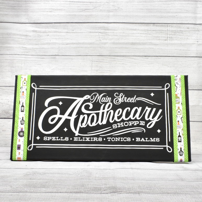
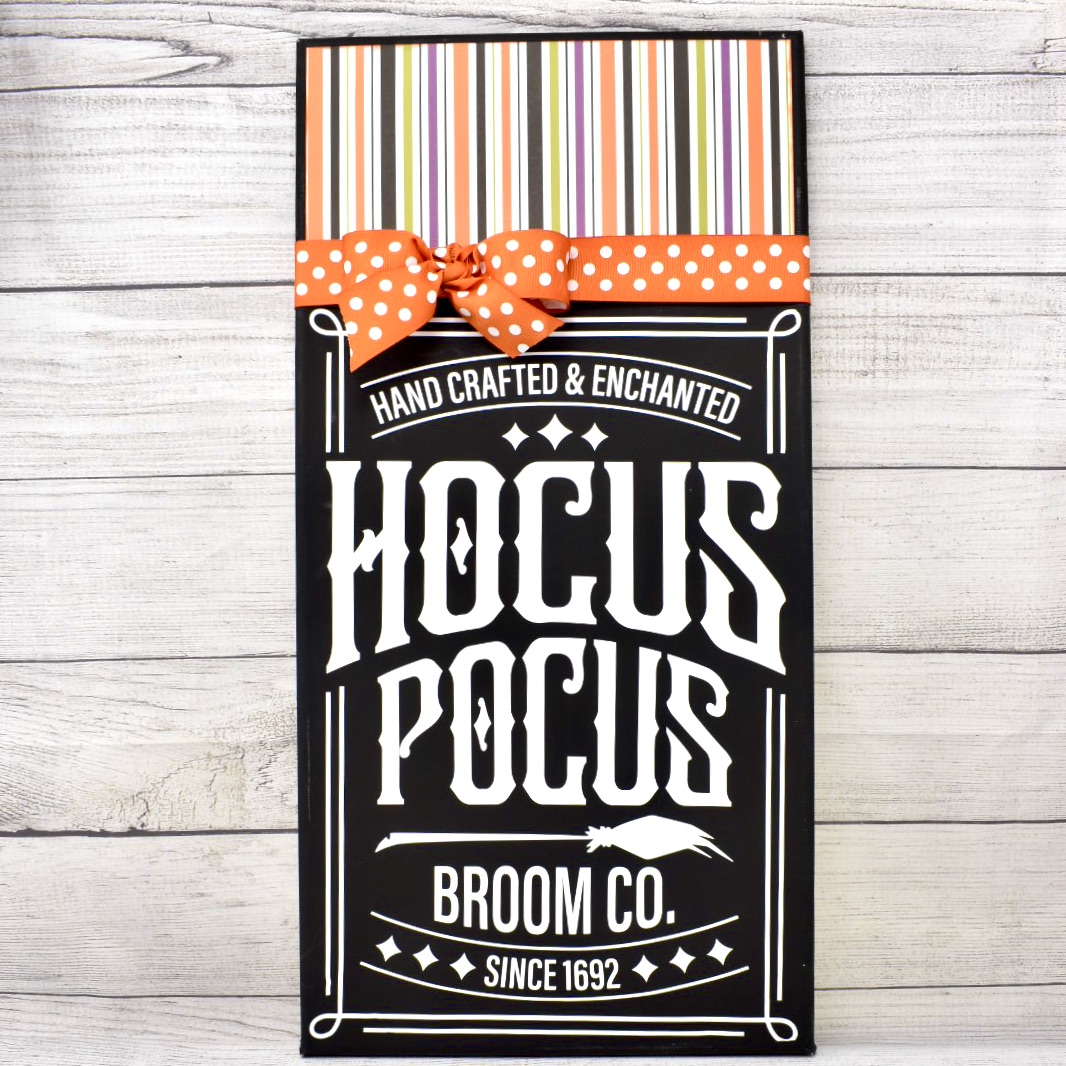
Hi there paper crafting friends!  It’s Michelle Starcher, aka the Bookish Designer, popping in on the blog to share a few canvas signs I put together this weekend.  Both signs feature paper from one of Lori’s newest collections from Echo Park Paper, I Love Halloween.  This set is loaded with spooky, cute graphics and traditional Halloween colors.  For my signs, I used two Halloween word art files:  Hocus Pocus Broom Co. (SVG, Silhouette) and Apothecary Shoppe (SVG, Silhouette).

I have been wanting to create a canvas project using Lori’s word art files for awhile now, and these Halloween files were the perfect excuse!  For both projects, I used black canvases available at Michaels. The canvases come in a variety of sizes, including the 10×20 and 12×24 sizes I used for my two canvas projects.  Typically, I use white canvases, but for my Halloween projects, I wanted to try using the black.

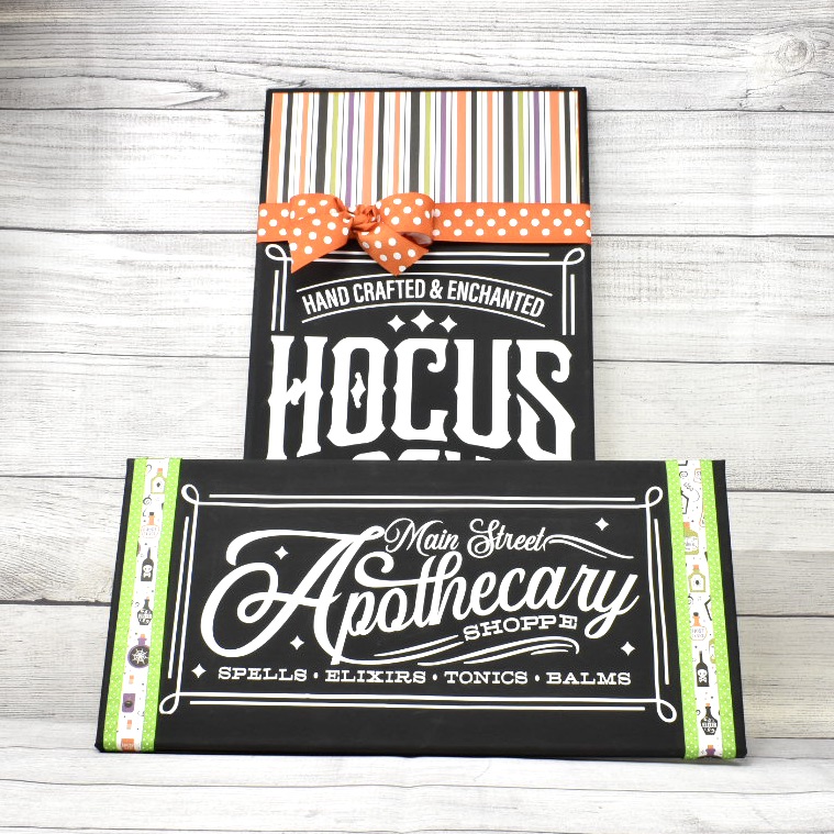
When I opened the files in Cricut Design Space, the files were a lot smaller than I needed them to be for my canvases, so I resized them to fit my canvases.  For the Apothecary Shoppe canvas, I resized the file to be about 8×16 to fit on the 10×20 canvas.  I used permanent white vinyl for this project.  I added paper from Lori’s I Love Halloween collection and lime green ribbon for a little extra color on the project.

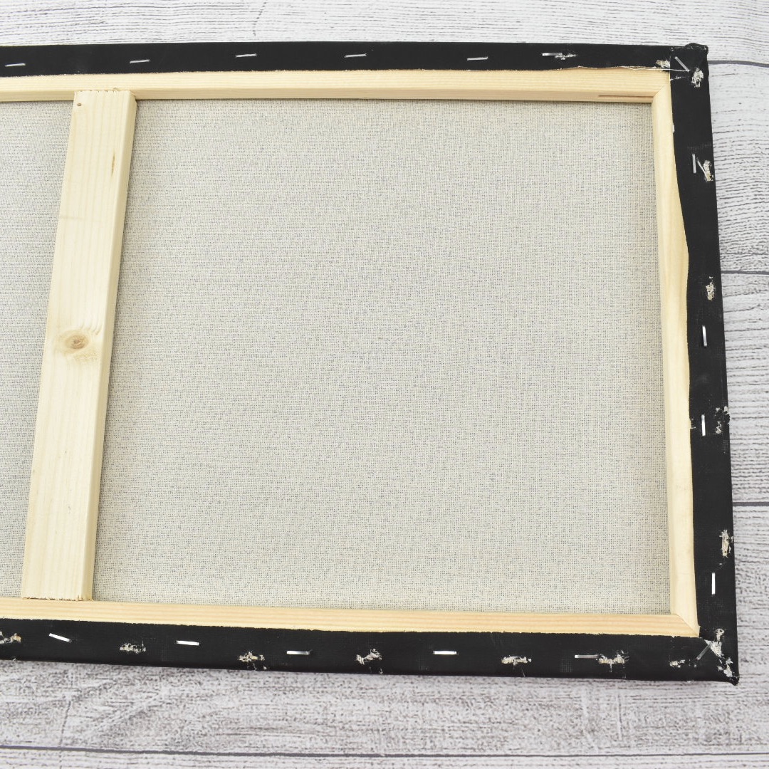
For the Hocus Pocus Broom Co. project, I resized the file to about 11×17.  For this project, I used Iron-On vinyl and my Cricut Heat Press.  Using the iron-on material was much easier than using the vinyl when it came to weeding the project and transferring the word art to the canvas.  However, I had to remove the canvas from the wooden frame in order to apply the word art.  It wasn’t hard to do though, just make sure you have a staple puller and staple gun on hand to put it back together.

For my final touches on the Hocus Pocus Broom Co. canvas, I added striped paper and some orange polka dot ribbon to finish the project off.  I added the paper using Tacky Tape.  In my experience this works really well when adhering items to the canvas.

I really like how the projects turned out, and I am excited about all the new word art Lori has available in the shop this week to create some Christmas canvas projects.

Until next time,

Michelle

How to Design Word Art in Silhouette Studio

Don’t you just love all the adorable word art you see everywhere you go? Take a look at Pinterest or a trip to the local store and there are fun phrases, quotes and sayings all over the place. Some are cut out of vinyl, others are printed, and some are an online graphic. You can create these fun phrases in Silhouette Studio (even if you don’t have a Silhouette machine). You can download the software for FREE and use it to create printable projects! Once you have this amazing program all you need is some fun fonts to work with. I have to admit, I collect a lot of fonts so I have plenty of options when I start working on a project. I like to get them at a good price like the ones over at FontBundles.

While word art may look easy to create, it can be time consuming and a little overwhelming with when you actually start working on one. How do you combine fonts effectually to create hierarchy and visual interest? There are some graphic design rules to follow that can help you combine fonts in a pleasing way. Hopefully these tips will help when you tackle your next typography project!

Be sure to watch the video tutorial HERE as I demonstrate how to design this cute word art…

Contrast

Create contrast by combining fonts that are different but compliment each other. However, remember that one of the fonts should take the lead and the other should be a supporting font.

  • Combine different styles like serif/san serif.
  • Combine fonts with different moods like modern/classic or formal/informal.
  • Combine different font weights such as a heavy headline with a lighter body font.

Harmony

Create harmony by combining fonts with similar elements.

  • Combine fonts with similar moods.
  • Combine fonts with similar proportions such as x-height, ascenders /descenders, and kerning (the space between the letters).
  • Limit the color scheme to a range of harmonious colors (use the color wheel).

A couple of rules of thumb: 

  • Avoid combining multiple san serif fonts unless they are very different from one another.
  • Avoid combining multiple script fonts because they are so strong that they will compete with each other.

Creating your own word art can be so rewarding! You can really make some fun projects out of phrases and words when fonts are combined properly. Follow these tips I’ve given you, use your own creative judgment, and have fun!

Do you like the fonts I’m showcasing here in this blog post? They come from the awesome Majestic Font Bundle that is available the next 20 days. It includes 40 magnificent fonts for $29. That makes them 72¢ per font. REALLY?? That’s a deal for a gorgeous set of fonts. Also, be sure to check out the Road to Summer Font Bundle while you’re there. And, at the very lest… be SURE to pick up the FREE font of the week HERE.

Majestic Font Bundle

Road to Summer Font Bundle

Have a great day!